We are going to start by bootstrapping a react app with tailwind CSS. If you don't know how to setup Tailwind CSS with react then head over to this link it has a clean installation guide by the tailwind team.
After setting up your project head over to App.js and clean all the pre-written code .
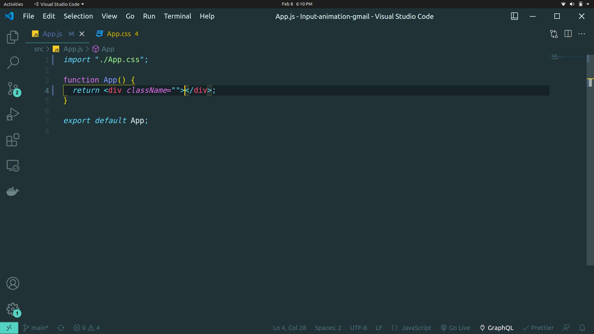
we are going to make the background of the app black and will center the input field.
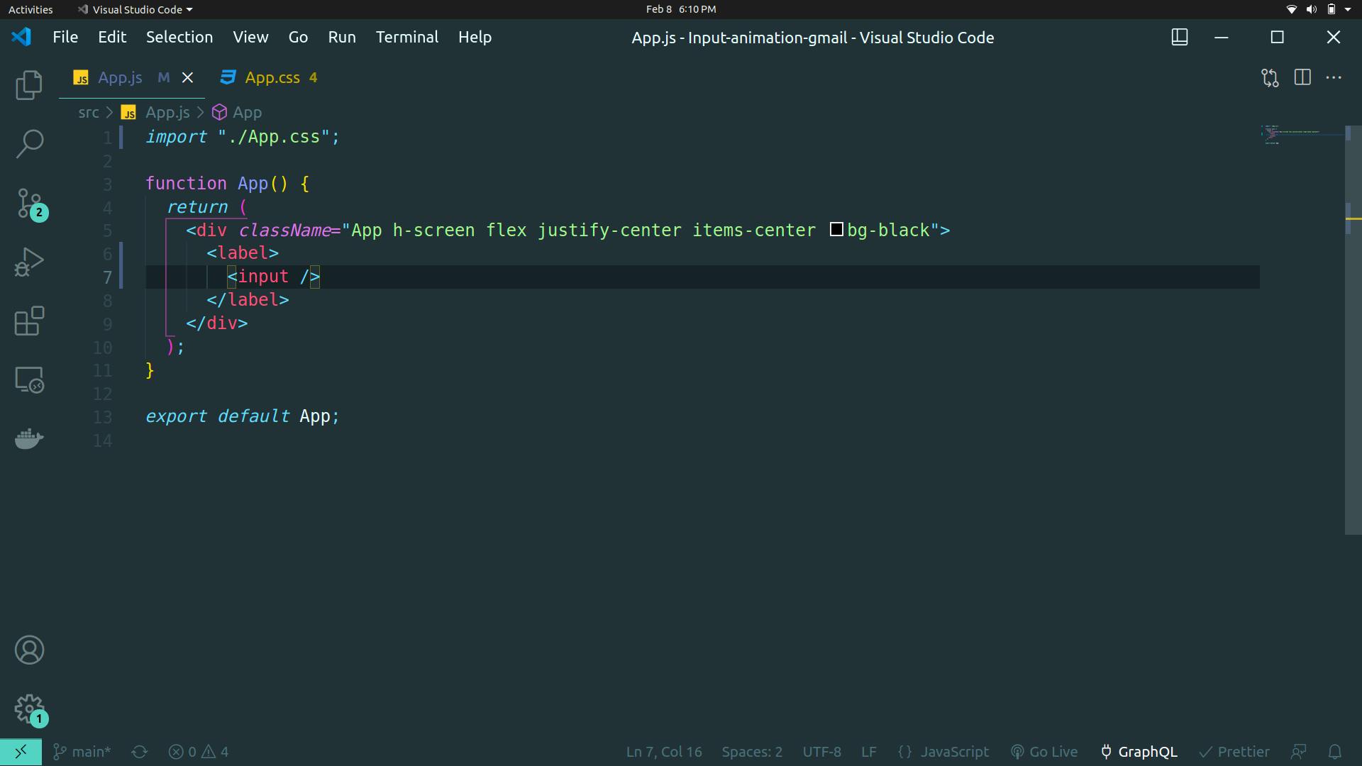
in the browser, it will look like this
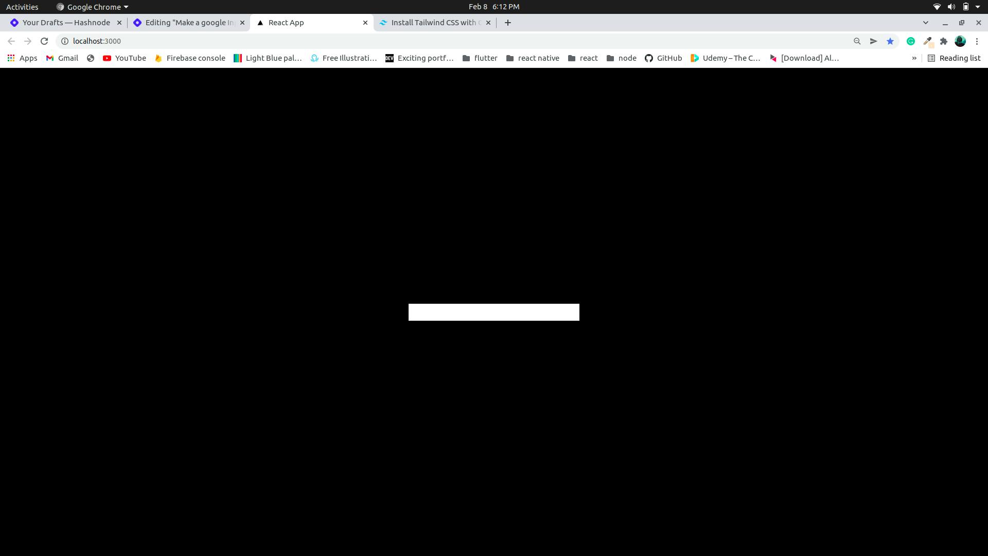
Now we do some basic styling we give the input height of 20 which is 5rem and width of 96 which is 24rem, we give the background black that is bg-black and border-2 which is border-width 2px and rounded-lg is border-radius 0.5 rem similarly we have border-opacity-50, outline-none is used to remove the default border that appears when we click on the input field. If you're new to tailwind CSS this might look a bit overwhelming, it's almost like writing the CSS values directly into the HTML with a little change in the syntax. The above styling should result in something like this
now when the user clicks on the input we want the border of the input to turn blue and text to white, by default the color of the text is black,and to make the transition from white border to blue border smooth we add a transition duration
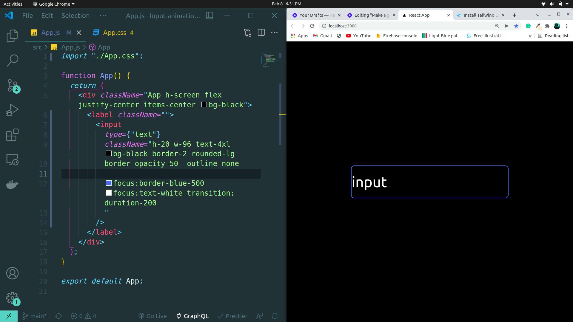
focus is a pseudo-element we can use to style specific in-time user interaction. e.g when a user clicks on an input build or button etc
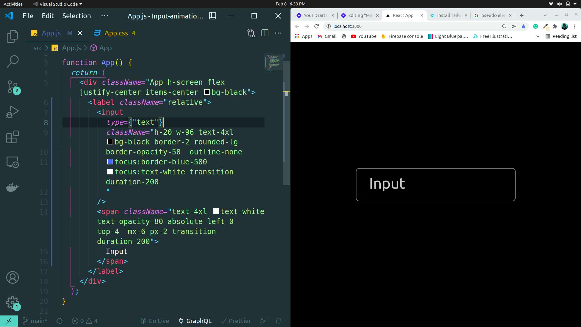
you can see in the above output that we have changed it a bit. As we wanted the word input on top of the input box, therefore we made our label (line no. 6) relative and then positioned our span accordingly with absolute left-0 top-4. This is a basic CSS concept. If you don't know about relative and absolute positioning in CSS, please read about it.
now we need to make the animation when we click on the input field we want the input to go up to the border like this
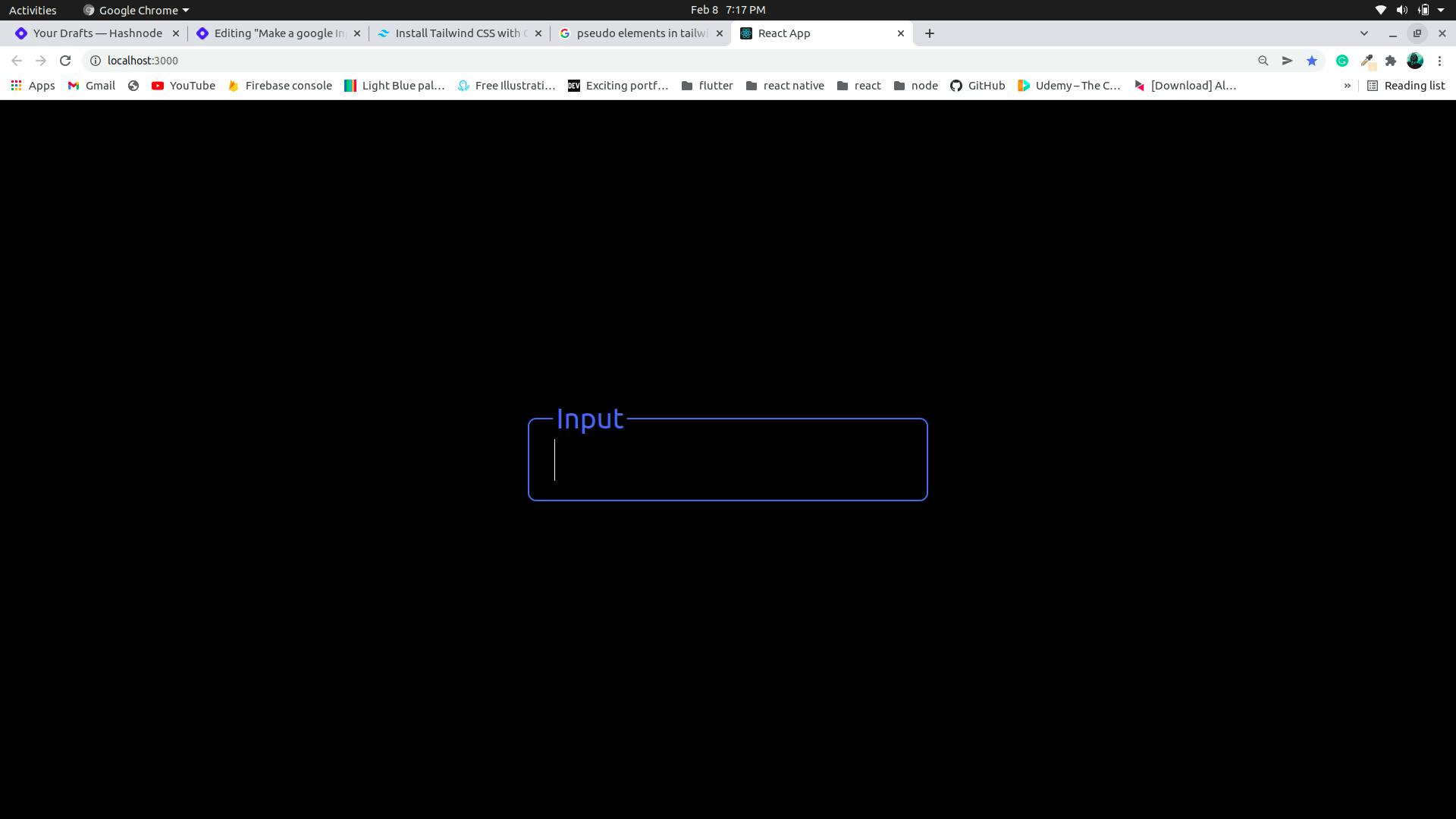
to get the above look we will go to our app.css and customize it
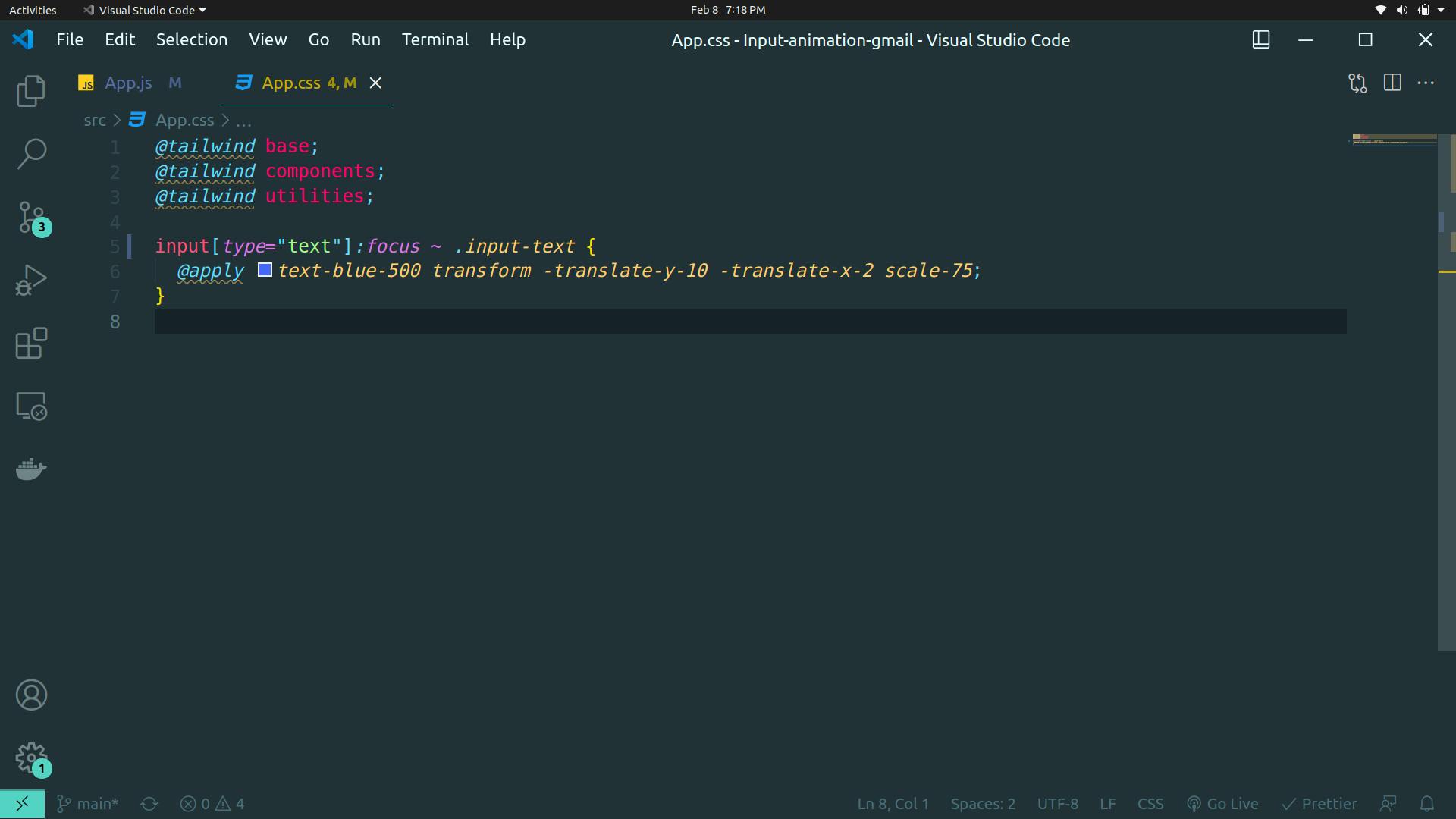
and we get our gmail like input field.