All HTML elements can be visualized as boxes
The box model is simply a container that wraps around every HTML element. It consists of four parts: the actual content, padding, borders, and margins. Each of these properties can be used individually as per the requirement to enhance the overall appearance and interface of the website.
What we will learn
Box Model Components
- Content
- Padding
- Border
- Margin
Calculation of height and width
Box Model Components
As mentioned above there are 4 important components of the box model-
Content
It is the information and images that occupy the box. It's the actual content that you want to display.
Padding
This is the transparent area that surrounds the content. It lies between the content and border of the box model. We can set the padding on all four sides either individually or all at once. It is declared in the following ways:
For all 4 sides:
padding: 2px;For top-bottom and left-right sides respectively:
padding: 2px 4px;For the top, right, bottom, left sides respectively:
padding: 2px 4px 6px 8px;
Border
As the name suggests, this is the outline of the box model. It has several properties like color, border-radius, etc. Let's take an example. Consider you have a div having class name as main :
<div class="main">Content goes here...</div>
Let's assign a solid, blue-colored border of 2px around it.
.main{
  width: 300px;
  border: 2px solid blue;
}
Margin
It is the transparent area outside the border. Apart from the 3 ways mentioned in padding, the margin also has auto property. It can be used if the width of the element is set. Then, you can set the left and right margins to auto to horizontally center that element within its container. It can be used to give margin only to right or left, but that discussion would be covered in some other blog. Here we will consider the most common use-case of margin-auto property. By assigning auto to an element's left and right margins, they take up the available horizontal space in the element’s container equally – and thus the element gets centered. The element will take up the width you specify, then the remaining space will be split evenly between the two margins.
Now, let's center the div from our previous example, using the margin-auto property.
.main{
  width: 300px;
  margin: auto;
  border: 2px solid blue;
}
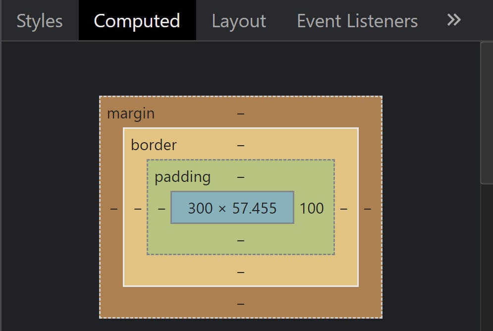
Refer to the below image from the developer console 👇

The blue region is the content, then comes the padding, then the border, and the outermost region is the margin.
Calculation of height and width of an element
Whenever we set the height or width property of any element, it is by default the height and width of the content region. After rendering, the actual height and width will be calculated by taking into consideration the content region, padding, borders, and margin. Consider the following example.
.main{
  width: 350px;
  padding: 10px;
  border: 5px solid grey;
  margin: 5px;
}
This element will have a total width of 390px.
Here's how it's calculated:
Total element width = width(350px) + left padding(10px) + right padding(10px) + left border(5px) + right border(5px) + left margin(5px) + right margin(5px)
Similarly, the total element height can be calculated as follows:
Total element height = height + top padding + bottom padding + top border + bottom border + top margin + bottom margin
The next and very important concept is the box-sizing property of the box model. We'll discuss that in the upcoming blog.
That's it! I hope this blog gives you a basic idea about the box model and its different properties. Thanks for reading 🙏 Any further suggestions are highly appreciated 💐