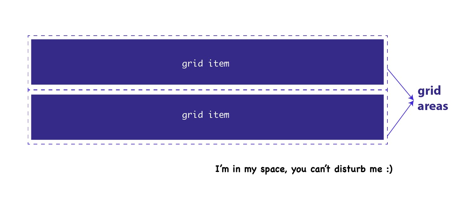
Grid-template-areas (CSS grid system)

grid-template-areas
Defines a grid template by referencing the names of the grid areas which are specified with the grid-area property
- Repeating the name of a grid area causes the content to span those cells
- A period signifies an empty cell.
- Each row in your declaration needs to have the same number of cells.
- Adjacent periods mean a single dot. As long as the periods do not have spaces between them.
- The grid-gap property defines the grid’s gutters and is shorthand for grid-column-gap and grid-row-gap.
This is the fun part. grid-template-areas defines the areas available in the grid. The name given to grid areas are arbitrary but should be sensible. The grid-template-areas also provides a crude visual representation of the page layout.
Discoveries/Rules:
- You cannot seperate a single grid-area with a dot
grid-template-areas: "side . side " /* This will not work */ "head head head " "realtor realtor realtor"; - You cannot seperate a single grid-area with an area
grid-template-areas: "side side side " "head realtor head "/* This will not work */ "head realtor head ";/* This will not work */ - An area cannot go but horizontal and vertical at a time
grid-template-areas: "side side side " /* is will not work */ "side realtor head " "side realtor head "; - Ensure the content of a container are all assigned a grid area if the container is been given a grid-teamplate-area
- You cannot seperate a single grid-area with a dot
This is cool
<div class="container">

    <div class="sidebar">
      sidebar
    </div>

    <header class="header">
      header
    </header>

    <div class="realtors">
      realtors
    </div>
</div>

    <section class="features">
      features
    </section>

But this will be messy
<div class="container">

    <div class="sidebar">
      sidebar
    </div>

    <header class="header">
      header
    </header>

    <div class="realtors">
      realtors
    </div>

    <section class="features">
      features /* Because of this */
    </section>
</div>

With the container been a gird system
.sidebar {
  background-color: orange;
   grid-area: side;
}

.header {
  background-color: green;
  grid-area: head;
}

.realtors {
  background-color: blue;
   grid-area: realtor;
}
.features {
  background-color: purple;
   grid-area: fea ;
}

.container {
  display: grid;
  border: 1px solid red;
  grid-template-columns: repeat(3, auto) ;
  grid-template-rows: repeat(3, 50px);

  grid-template-areas:
    "side .... .... realtor"
    "side head head  realtor"
    "side . . .";
}
Having a great grid-template-area system
 <div class="container">

    <div class="sidebar">
      sidebar
    </div>

    <header class="header">
      header
    </header>

    <div class="realtors">
      raltors
    </div>

    <section class="features">
      features
    </section>
</div>
.container {
  display: grid;
  border: 1px solid red;
  grid-template-columns: repeat(4, auto) ;
  grid-template-rows: repeat(3, 50px);

  grid-template-areas:
    "side head head  head"
    "side realtor realtor   fea"
    "side realtor realtor  fea   ";
}
