


If you've used hashnode on a phone, you would know that hashnode has a very flexible UI that adapts to any screen sizes while still looking controlled and beautiful.
One of the challenges doing in this is, handling text. I was exploring some solutions for controlling multi-line text wraps when I came across this interesting way twitter handles it.
Let's dive in! 👩💻
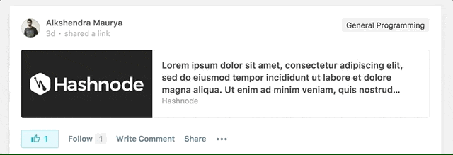
Say you have few boxes in grid with some text inside of them and say, the amount of text is variable so the height of the blocks is uneven.
Something like this:

While, in CSS, you can truncate the text to one line using text-overflow: ellipsis;
But how do you truncate a multiple lines of text to make it look like this?
Comes in: line-clamp ✨
With line-clamp, you can contain a block of text into certain number of lines, so the text never goes out of those lines.
Here's how you would do that:
.line-clamp {
    display: -webkit-box;
    -webkit-box-orient: vertical;
    -webkit-line-clamp: 3;
}
Here, what we are basically doing is, restricting the text into a maximum of 3 lines. When the text starts overflowing out of 3 lines, it gets truncated.
This has to be used in conjunction with display: -webkit-box-flex; for it to work.
it's responsive!
Since line-clamp works on the number of lines in the text, the words start getting truncated as they overflow out of the block.
This means your layout would always be in your control, despite the screen size.
You can make it even more flexible by sprinkling some media query magic to control the number of lines for different screen sizes.
@media (max-width: 768px) {
    .line-clamp {
        -webkit-line-clamp: 2;
    }
}
Support
Now, the support at the moment is only for webkit based browsers and is most likely going to stay that way.
So we're talking about this demographic:
Which isn't pretty bad, the only major browsers left behind are Firefox and edge. Which brings us to the next section:
Fallback
Since the text is controlled by the number of lines, the easiest solution is to calculate the height of the text block and do a overflow: none for the height.
Here's a little codepen I've put together as a demo:
Hope you enjoyed reading this, do share your thoughts in the comments! 🙂